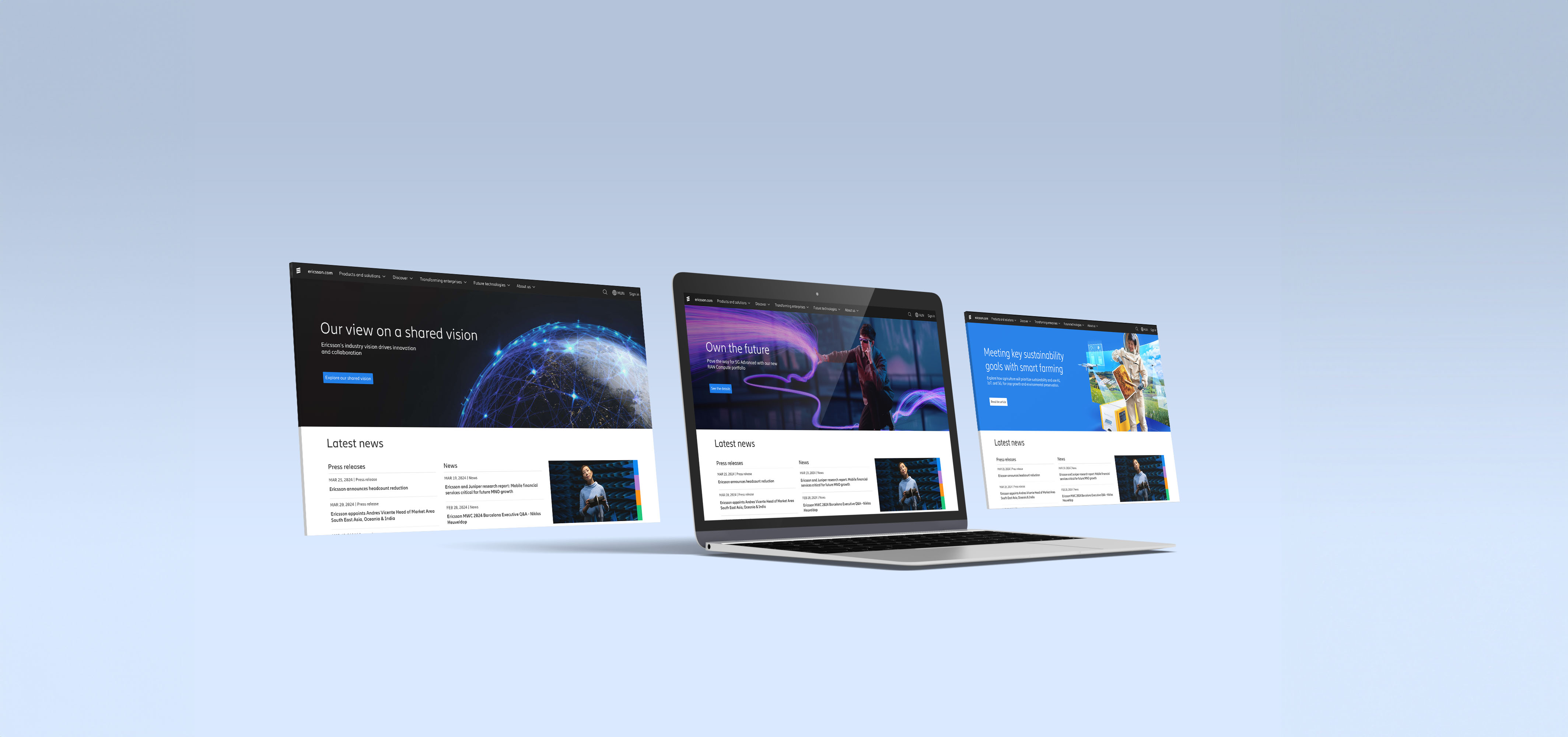
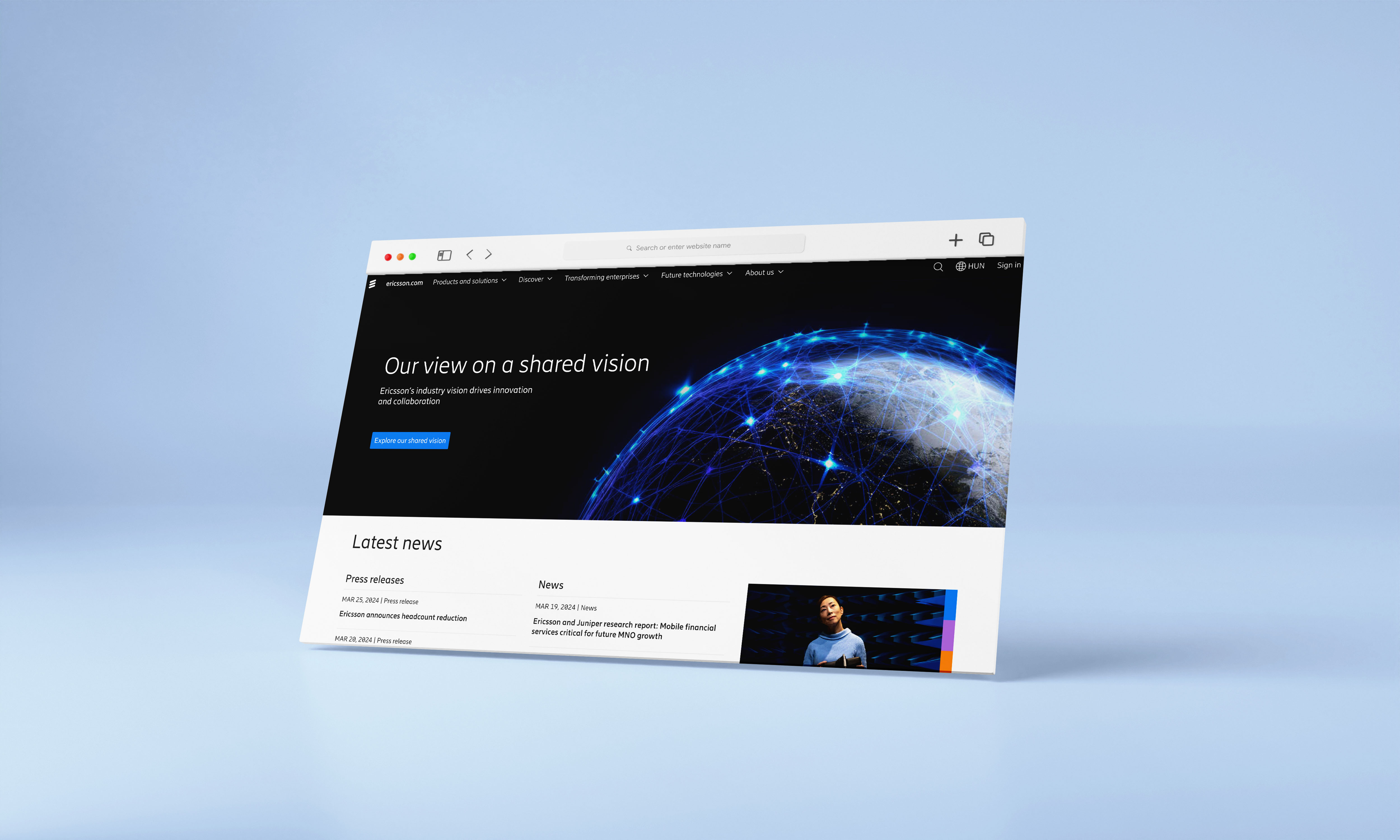
Ericsson.com
As a part of a bigger A/B testing and optimization program, we were aiming to identify user needs, enable segmentation, and optimize the current user journey to reduce friction as much as possible. In collaboration with the Valtech UX team, I joined to help with an exciting project to enhance the user experience of the Ericsson.com webpage. My role involved designing new buttons using Ericsson's design system, aimed at enhancing user interaction.
01
Background and Purpose
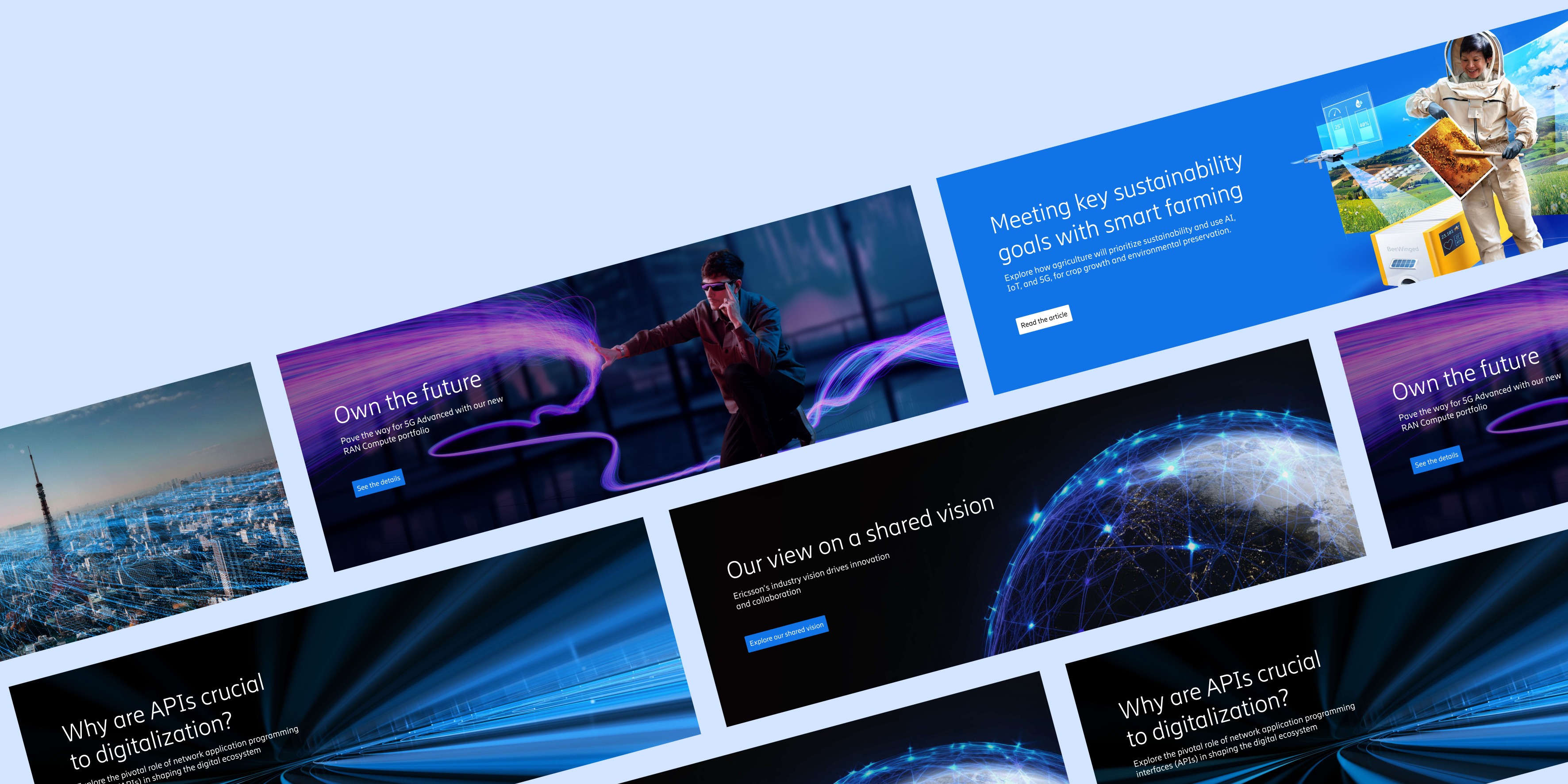
With the current CTA we saw extremely low click-through rate and attractiveness rate, despite a relatively high float time and hover rate on Ericsson’s homepage. My objective was to make the module more salient, to make it more attractive to click on by following documentation guidelines and making copy more bold and actionable with 3 different variants to test for most efficient kind.
02
Hypothesis
"Providing a salient module on the homepage will increase CTR."
03
Goals
Improve on the 3 strategic goals: capture attention, influence perception, and create connections, one test at a time. And implementing a build-measure-learn framework across multiple streams of work.


